|
|

|

|
| e-Pub |
Section: New Results
Wall Displays
Ultra-high-resolution wall displays feature a very high pixel density over a large physical surface, which makes them well-suited to the collaborative, exploratory visualization of large datasets (see Sections 6.3.1 and 6.3.2). We have continued working on the design, implementation and evaluation of interactive visualization techniques for such ultra-high-resolution wall-sized displays, focusing, in some of these projects, on the collaboration between users who perform different data manipulation and analysis tasks.
|
-
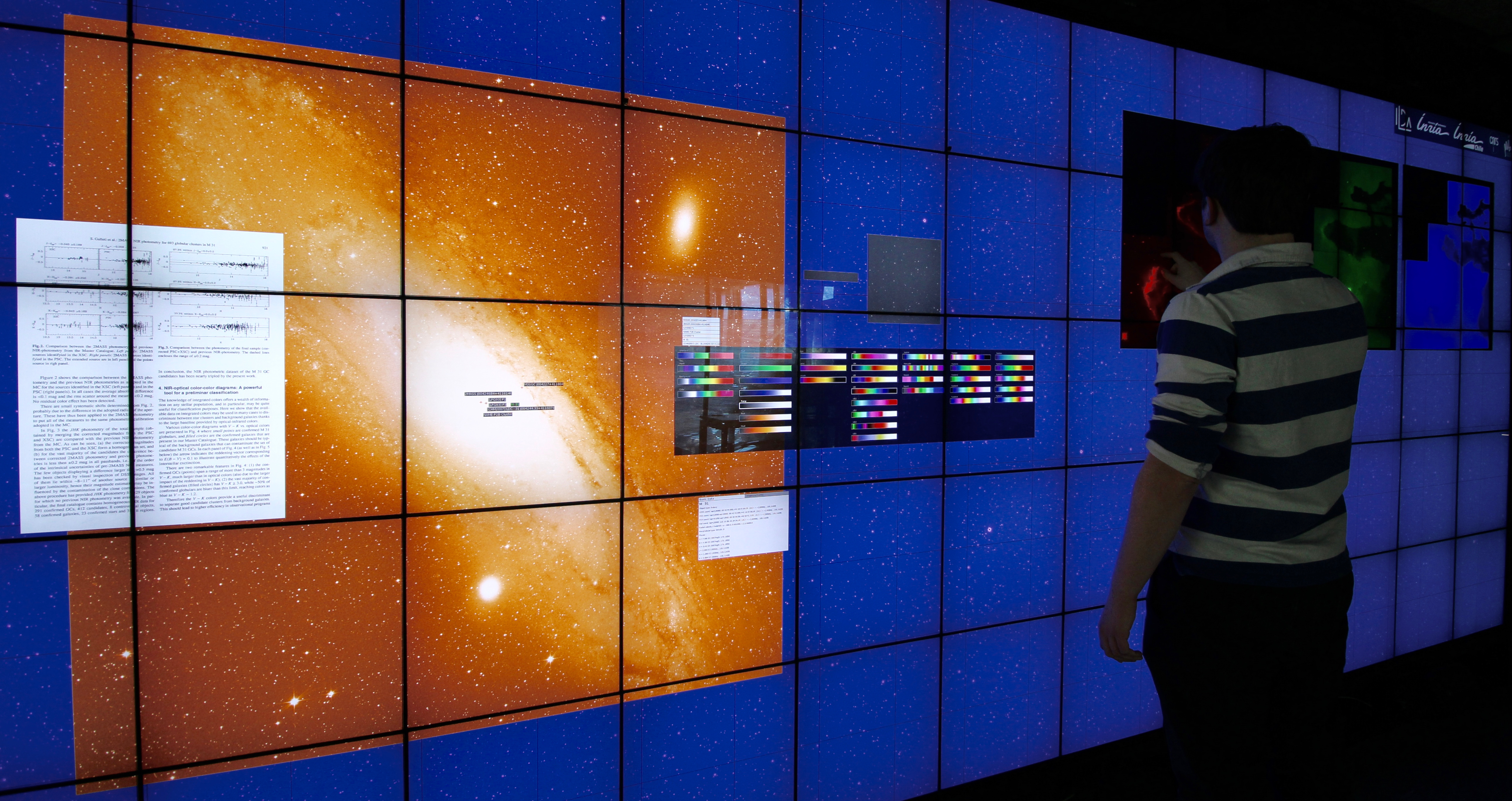
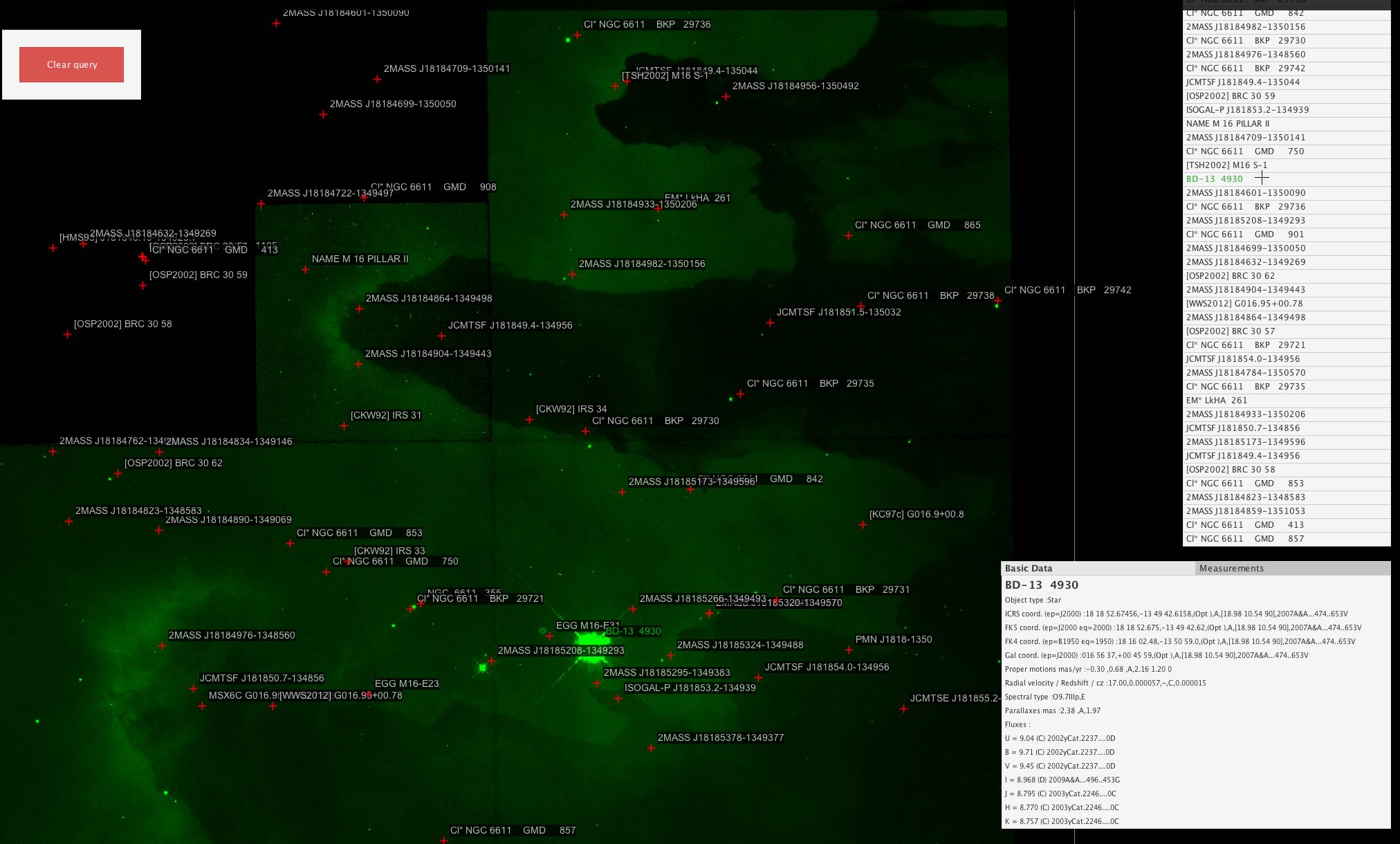
We continued working on FITS-OW, an application designed for such wall displays, that enables astronomers to navigate in large collections of FITS images, query astronomical databases, and display detailed, complementary data and documents about multiple sources simultaneously. We published a paper about FITS-OW [7], in which we describe the system, reporting on the technical challenges we addressed in terms of distributed graphics rendering and data sharing over the computer clusters that drive wall displays. The article also describes how astronomers interact with their data using both the wall's touch-sensitive surface and handheld devices. This work was also featured as a short article in the SPIE Newsroom (see Section 10.3).
-
Wall-sized displays support small groups of users working together on large amounts of data. Observational studies of such settings have shown that users adopt a range of collaboration styles, from loosely to closely coupled. Shared interaction techniques, in which multiple users perform a command collaboratively, have also been introduced to support co-located collaborative work. In [19], we operationalized five collaborative situations with increasing levels of coupling, and tested the effects of providing shared interaction support for a data manipulation task in each situation. The results show the benefits of shared interaction for close collaboration: it encourages collaborative manipulation, it is more efficient and preferred by users, and it reduces physical navigation and fatigue. We also identify the time costs caused by disruption and communication in loose collaboration and analyze the trade-offs between parallelization and close collaboration. These findings inform the design of shared interaction techniques to support collaboration on wall-sized displays.
-
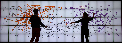
We also studied how pairs explore graphs on a touch enabled wall-display [16], using two selection techniques adapted for collaboration: a basic localized selection, and a propagation selection technique that uses the idea of diffusion/transmission from an origin node. We assessed in a controlled experiment the impact of selection technique on a shortest path identification task. Pairs consistently divided space even though the task is not spatially divisible. The basic selection technique, that has a localized visual effect, led to parallel work that negatively impacted accuracy. The large visual footprint of the propagation technique led to close coordination, improving speed and accuracy for complex graphs only. We then observed the use of propagation on additional graph topology tasks, confirming pair strategies on spatial division and coordination.
-
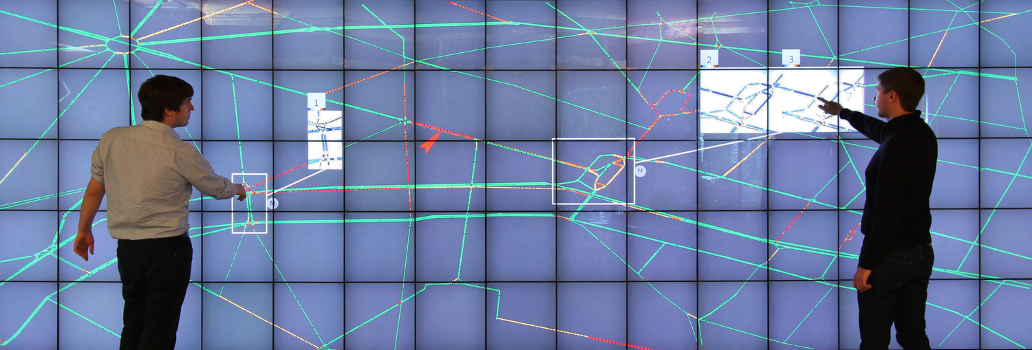
In [22], we focused on road traffic control center. Road traffic control centers are of vital importance to modern cities. Interviews with controllers in two such centers identified the need to incorporate the visualization of results from predictive traffic models with real traffic, to help operators choose among different interventions on the network. We explore this idea in a prototype that runs on a wall display, and supports direct touch and input from workstations and mobile devices. Apart from basic functionality to manage the current traffic such as changing traffic light duration or speed limits, the prototype incorporates traffic simulations for forecasting results of possible actions, highlighting their differences to current traffic. Based on needs identified in our interviews, we offered two techniques that visually combine simulated and real situations, taking advantage of the large display space: multiple independent views and DragMagic, a variation of magic lenses. A preliminary laboratory experiment suggests that both techniques are viable design options, even for monitoring several simulations and areas of interest, contrary to expectations from previous work. However DragMagics are easier to master.
-
Immersion is the subjective impression of being deeply involved in a specific situation, and can be sensory or cognitive. In a position paper [23], we used a basic model of visual perception to study how ultra-high resolution wall displays can provide visual immersion. With their large size, depending on the position of viewers in front of them, wall displays can provide a surrounding and vivid environment. Users close to the wall can have their visual field filled by the wall and they are able to see clearly a large amount information with a fine resolution. However, when close to the wall, visual distortion due to large possible viewing angles, can affect the viewing of data. On the contrary, from far away, distortion is no longer an issue, but the viewers' visual field is not fully contained inside the wall, and the information details seen are less fine.
|