|
|

|

|
| e-Pub |
Section: New Results
Interactive visualization and animations
Participants : Amira Chalbi-Neffati, Fanny Chevalier, Nicolas Roussel.
Social network analysis
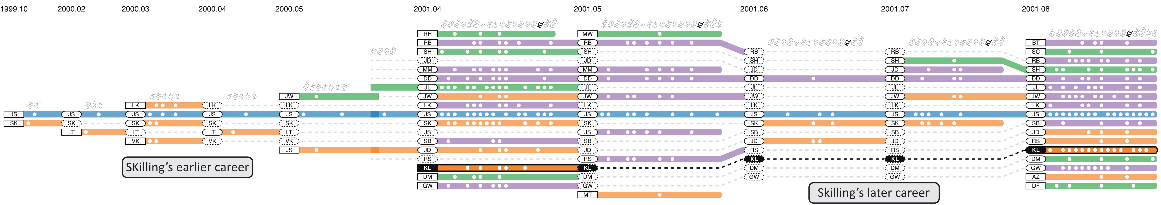
The egocentric analysis of dynamic networks focuses on discovering the temporal patterns of a subnetwork around a specific central actor, i.e. an ego-network. These types of analyses are useful in many application domains, such as social science and business intelligence, providing insights about how the central actor interacts with the outside world. EgoLines is an interactive visualization we designed to support the egocentric analysis of dynamic networks . Using a “subway map” metaphor, a user can trace an individual actor over the evolution of the ego-network (Figure 2). The design of EgoLines is grounded in a set of key analytical questions pertinent to egocentric analysis, derived from interviews with three domain experts and general network analysis tasks. The results of controlled experiments with end-users and domain experts show its effectiveness in egocentric analysis tasks. Egolines can be tested at http://fannychevalier.net/egolines.html
|
Cross-sectional cohort phenotype
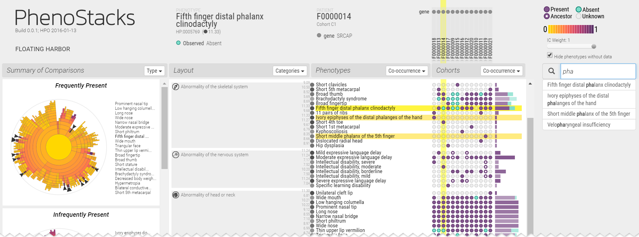
Cross-sectional phenotype studies are used by genetics researchers to better understand how phenotypes vary across patients with genetic diseases, both within and between cohorts. Analyses within cohorts identify patterns between phenotypes and patients, e.g. co-occurrence, and isolate special cases, e.g. potential outliers). Comparing the variation of phenotypes between two cohorts can help distinguish how different factors affect disease manifestation, e.g. causal genes, age of onset.). PhenoStacks is a novel visual analytics tool we designed to support the exploration of phenotype variation within and between cross-sectional patient cohorts . By leveraging the semantic hierarchy of the Human Phenotype Ontology, phenotypes are presented in context, can be grouped and clustered, and are summarized via overviews to support the exploration of phenotype distributions (Figure 3). The HPO is rarely used for visualization and was only recently first employed in PhenoBlocks [49]. In this prior work, we used the HPO to visualize phenotypes in clinical diagnosis settings, supporting the pairwise comparison of patient phenotypes using explicit encoding. In this new work, we turn our focus to genetics researchers conducting cross-sectional cohort studies, where the distribution of phenotypes is compared across many patients. The design of PhenoStacks was motivated by formative interviews with genetics researchers. The results of a deployment evaluation with four expert genetics researchers suggest that PhenoStacks can help identify phenotype patterns, investigate data quality issues, and inform data collection design. PhenoStacks is available from http://phenostacks.org/
|
Human routine behavior
Human routines are blueprints of behavior, which allow people to accomplish purposeful repetitive tasks at many levels, ranging from the structure of their day to how they drive through an intersection. People express their routines through actions that they perform in the particular situations that triggered those actions. An ability to model routines and understand the situations in which they are likely to occur could allow technology to help people improve their bad habits, inexpert behavior, and other suboptimal routines. However, existing routine models do not capture the causal relationships between situations and actions that describe routines. Byproducts of an existing activity prediction algorithm can be used to model those causal relationships in routines [23]. We applied this algorithm on two example datasets, and showed that the modeled routines are meaningful — that they are predictive of people’s actions and that the modeled causal relationships provide insights about the routines that match findings from previous research. Our approach offers a generalizable solution to model and reason about routines. We show that the extracted routine patterns are at least as predictive of behaviors in the two behavior logs as the baseline we establish with existing algorithms.
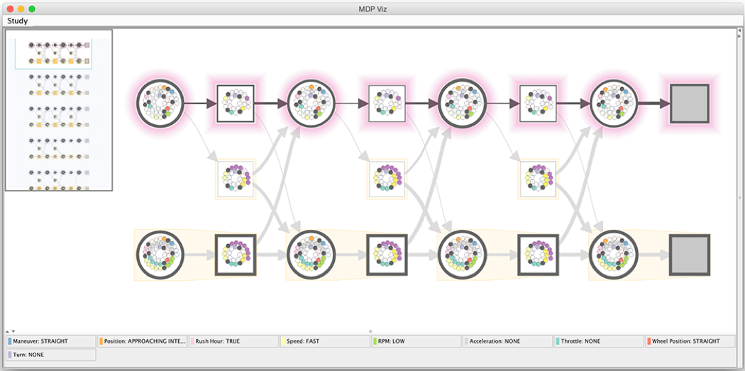
To make the routine behavior models created using our approach accessible to participants and allow them to investigate the extracted routine patterns, we developed a simple visualization tool. To maintain a level of familiarity, we base our visual encoding of routine behavior elements on a traditional visual representation of an MDP as a graph (Figure 4). Our MDP graph contains nodes representing states (as circles) and actions (as squares), directed edges from state nodes to action nodes (indicating possible actions people can perform in those states), and directed edges from actions to states (indicating state transitions for any given state and action combination).
|
Meta-analysis of data based on user-authored annotations
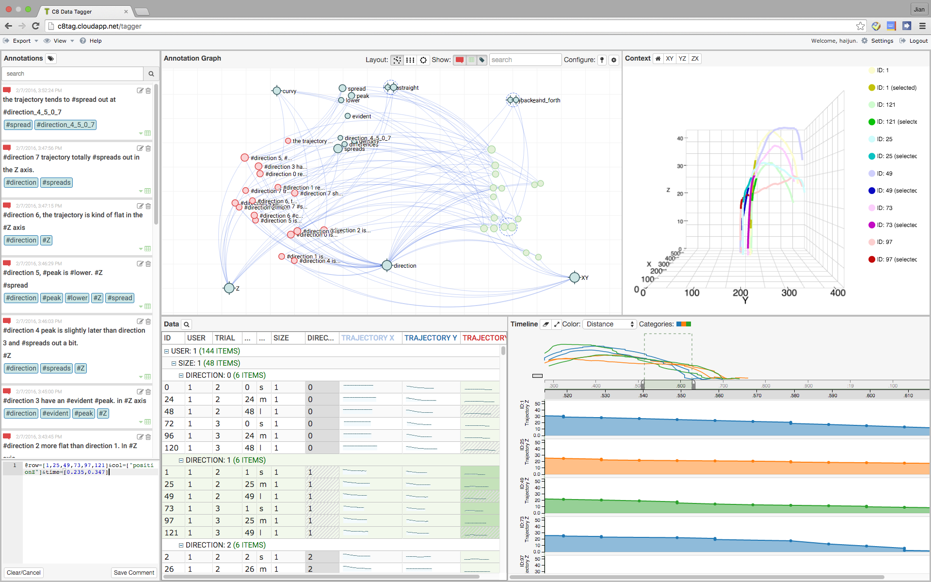
User-authored annotations of data can support analysts in the activity of hypothesis generation and sensemaking, where it is not only critical to document key observations, but also to communicate insights between analysts. Annotation Graphs are dynamic graph visualizations that enable meta-analysis of data based on user-authored annotations . The annotation graph topology encodes annotation semantics, which describe the content of and relations between data selections, comments, and tags. We present a mixed-initiative approach to graph layout that integrates an analyst’s manual manipulations with an automatic method based on similarity inferred from the annotation semantics. Annotation graphs are implemented within a system, C8, that supports authoring annotations during exploratory analysis of a dataset (Figure 5). In this work, we develop and evaluate the system through an iterative user-centered design process with three experts, situated in the domain of analyzing HCI experiment data. The results suggest that annotation graphs are effective as a method of visually extending user-authored annotations to data meta-analysis for discovery and organization of ideas.
|
Fundamentals of animated transitions
Animations are increasingly used in interactive systems in order to enhance the usability and aesthetics of user interfaces. While animations are proven to be useful in many cases, we still find defective ones causing many problems, such as distracting users from their main task or making data exploration slower. The fact that such animations still exist proves that animations are not yet very well understood as a cognitive aid, and that we have not yet definitely decided what makes a well designed one. Our work on this topic aims at better understanding the different aspects of animations for user interfaces and exploring new methods and guidelines for designing them.
From bouncing icons that catch attention, to transitions helping with orientation, to tutorials, animations can serve numerous purposes. In , we revisit Baecker and Small’s pioneering work Animation at the Interface, 25 years later. We review academic publications and commercial systems, and interviewed 20 professionals of various backgrounds. Our insights led to an expanded set of roles played by animation in interfaces today for keeping in context, teaching, improving user experience, data encoding and visual discourse. We illustrate each role with examples from practice and research, discussed evaluation methods and point to opportunities for future research. This expanded description of roles aims at inspiring the HCI research community to find novel uses of animation, guide them towards evaluation and spark further research.
We have also studied different aspects of animations for visual analysis tasks. We have worked on the design of a new model for animated transitions, explored certain aspects of visual grouping for these transitions, and studied the impact of their temporal structure on data interpretation. These works, while still in progress, have been presented at the IHM doctoral consortium [39].