|
|

|

|
| e-Pub |
Section: New Results
Interactive visualization and animations
Participants : Amira Chalbi-Neffati, Fanny Chevalier [correspondent] , Nicolas Roussel.
Visualization literacy at elementary school
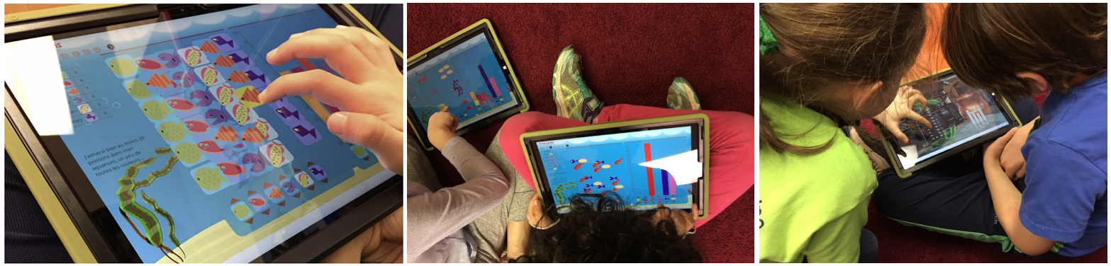
This work advances our understanding of children's visualization literacy, and aims to improve it with a novel approach for teaching visualization at elementary schools. We contributed an analysis of data graphics and activities employed in grade K to 4 educational materials, and conducted a survey with 16 elementary school teachers. We found that visualization education could benefit from integrating pedagogical strategies for teaching abstract concepts with established interactive visualization techniques. Building on these insights, we have developed and studied design principles for novel interactive teaching material aimed at increasing children’s visualization literacy. We developed C'est la vis, an online platform for teachers and students to respectively teach and learn about pictographs and bar charts (see Fig. 1), and reported on our initial observations of its use in grades K and 2 [17]. The application can be tested at https://cestlavis.github.io. This work was awarded a Best Paper Honorable Mention award at the ACM CHI conference and highlighted on FlowingData and Data Stories, two famous blogs on visualization.
|
Supporting handoff in asynchronous collaborative sensemaking
During asynchronous collaborative analysis, handoff of partial findings is challenging because externalizations produced by analysts may not adequately communicate their investigative process. To address this challenge, we developed techniques to automatically capture and help encode tacit aspects of the investigative process based on an analyst’s interactions, and streamline explicit authoring of handoff annotations [16]. We designed our techniques to mediate awareness of analysis coverage, support explicit communication of progress and uncertainty with annotation, and implicit communication through playback of investigation histories. To evaluate our techniques, we developed an interactive visual analysis system, KTGraph, that supports an asynchronous investigative document analysis task. We conducted a two-phase user study to characterize a set of handoff strategies and to compare investigative performance with and without our techniques. The results suggest that our techniques promote the use of more effective handoff strategies, help increase an awareness of prior investigative process and insights, as well as improve final investigative outcomes. This work received a Best Paper Honorable Mention award at the IEEE VIS-VAST conference.
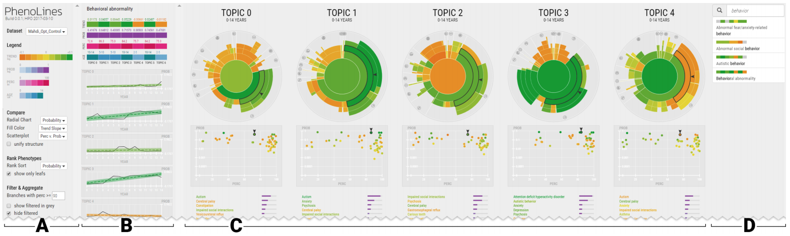
Phenotype comparison visualizations for disease subtyping via topic models
PhenoLines is a visual analysis tool for the interpretation of disease subtypes, derived from the application of topic models to clinical data [26]. Topic models enable one to mine cross-sectional patient comorbidity data (e.g., electronic health records) and construct disease subtypes—each with its own temporally evolving prevalence and co-occurrence of phenotypes—without requiring aligned longitudinal phenotype data for all patients. However, the dimensionality of topic models makes interpretation challenging, and de facto analyses provide little intuition regarding phenotype relevance or phenotype interrelationships. PhenoLines allows to compare phenotype prevalence within and across disease subtype topics (see Fig. 2), thus supporting subtype characterization, a task that involves identifying a proposed subtype’s dominant phenotypes, ages of effect, and clinical validity. We contributed a data transformation workflow that employs the Human Phenotype Ontology to hierarchically organize phenotypes and aggregate the evolving probabilities produced by topic models. We introduced a novel measure of phenotype relevance that can be used to simplify the resulting topology. The design of PhenoLines was motivated by formative interviews with machine learning and clinical experts. We conducted initial evaluations with machine learning experts and a medical domain expert. Results suggest that PhenoLines supports promising approaches for the characterization and optimization of topic models.
|
Understanding and designing animation for visualization
Animations are increasingly used in interactive systems in order to enhance the usability and aesthetics of user interfaces. While animations are proven to be useful in many cases, we still observe defective ones causing many problems, such as distracting users from their main task or making data exploration slower. The fact that such animations still exist proves that animations are not yet very well understood as a cognitive aid, and that we have not yet definitely decided what makes a well designed one. Our work on this topic aims at better understanding the different aspects of animations for user interfaces and exploring new methods and guidelines for designing them.
We explored the concept of dataTours, semi-automated narratives for prompting and sustaining exploratory analysis, as a complement to the predominant interactive data overview. Narratives are commonly and widely used for presenting and communicating results of data analyses and thus generally lead an observer to a specific resolution or conclusion regarding the question(s) they address. A dataTour, on the other hand, is meant to be an open-ended and adaptive narrative that can act as a scaffolding for the iterative process of exploration. Preliminary results were presented as a poster at the IEEE Infovis conference [38].