

Section: New Results
Blinded with Science or Informed by Charts? A Replication Study
Participants : Pierre Dragicevic [correspondant] , Yvonne Jansen.
|
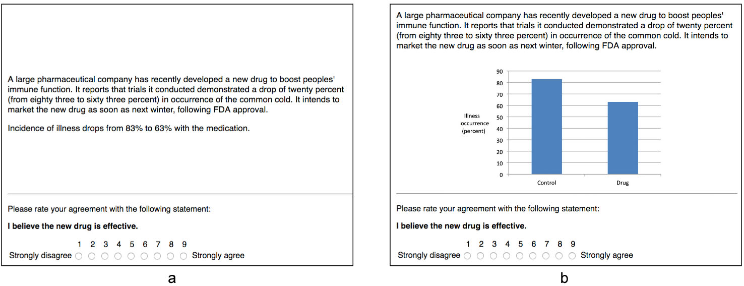
We provided a reappraisal of Tal and Wansink’s study “Blinded with Science”, where seemingly trivial charts were shown to increase belief in drug efficacy, presumably because charts are associated with science. Through a series of four replications conducted on two crowdsourcing platforms, we investigated an alternative explanation, namely, that the charts allowed participants to better assess the drug's efficacy. Considered together, our experiments suggested that the chart seems to have indeed promoted understanding, although the effect is likely very small. Meanwhile, we were unable to replicate the original study's findings, as text with chart appeared to be no more persuasive – and sometimes less persuasive – than text alone. This suggested that the effect may not be as robust as claimed and may need specific conditions to be reproduced. Regardless, within our experimental settings and considering our study as a whole ( = 623), the chart's contribution to understanding was clearly larger than its contribution to persuasion.
The main lesson from our study is that with charts, the peripheral route of persuasion cannot be studied independently from the central route: in order to establish that a chart biases judgment, it is necessary to also rigorously establish that it does not aid comprehension. Our replication also opens many relevant questions for infovis. Are charts really associated with science? More generally, what associations do charts or visualizations trigger depending on their visual design? When exactly is a chart trivial? Two arguments against minimalistic charts is that they take up space and they break the flow of the text. How do word-scale visualizations change these trade-offs?
Experimental material can be downloaded here: www.aviz.fr/blinded.