

Section: New Results
Visualization
|
-
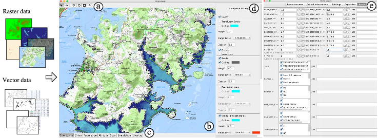
In the context of ANR-funded collaborative project MapMuxing (see Section 9.2.1), we investigated novel dynamic map compositing techniques for geovisualization. GIS software applications and other mapping tools enable users to correlate data from multiple layers and gain insight from the resulting visualizations. However, most of these applications only feature basic, monolithic layer compositing techniques. These techniques do not always support users effectively in their tasks, as we observed during interviews with GIS experts at IGN (French national cartographic institute). We designed MapMosaic (Figure 6), a novel approach based on dynamic visual compositing that enables users to interactively create and manipulate local composites of multiple vector and raster map layers, taking into account the semantics and attribute values of objects and fields in the compositing process. We evaluated MapMosaic's interaction model against that of QGIS (a widely used desktop GIS) and MAPublisher (a professional cartography tool) using the Cognitive Dimensions framework, showing that MapMosaic's model is more flexible and can support users more effectively in their tasks. Feedback obtained from experts further confirmed the potential of this highly dynamic approach to map layer compositing.
-
We also explored how different interactive visualizations of multidimensional datasets can affect how we make decisions [15]. We evaluated three elementary visualizations: parallel coordinates, scatterplot matrices and tabular visualizations. Our method consisted in first giving participants low-level analytic tasks, in order to ensure that they properly understood the visualizations and their interactions. Participants were then given multi-attribute choice tasks consisting of choosing holiday packages. We assessed decision support through multiple objective and subjective metrics, including a decision accuracy metric based on the consistency between the choice made and self-reported preferences for attributes. We found the three visualizations to be comparable on most metrics, with a slight advantage for tabular visualizations. In particular, tabular visualizations allow participants to reach decisions faster. Our results also suggest that indirect methods for assessing choice confidence may allow to better distinguish between visualizations than direct ones. Related to this topic, is our previous work on studying how biases can affect our decision making when using visualizations [14], work that was accepted in 2016 (and thus was part of last year's report) but appeared in print this year.
-
Beyond the actual interactive visualizations themselves, we studied how framing the questions to participants may affect the results of evaluating visualizations [19]. More specifically we explored the effects of providing task context when evaluating visualization tools in crowdsourced studies. We gave participants abstract information visualization tasks without any context; tasks where we added semantics to the dataset; and tasks with two types of backstory narratives: an analytic narrative and a decision-making narrative. We did not find evidence that adding data semantics increases accuracy, but that it increases attention and provides subjective benefits in terms of confidence, perceived easiness, task enjoyability and perceived usefulness of the visualization. Interestingly, we also found that backstory narratives, often used to motivate study participants, can even decrease accuracy.
-
Finally, we are interested in understanding how people understand more general multidimensional visualisations. We mention here again work with colleagues both from University of Konstanz [16] on a review of multidimensional visualizations in the forms of glyphs; and with colleagues from INRA on a mixed initiative system that aids navigation of complex multi-dimensional datasets [41]. Both these results were accepted for publication in 2016 (and were part of the previous report), but the work appeared in print this year.