

Section: New Results
High tech vision aid-systems for low-vision patients
Multilayered Analysis of Newspaper Structure and Design
Participants : Hui-Yin Wu, Pierre Kornprobst.
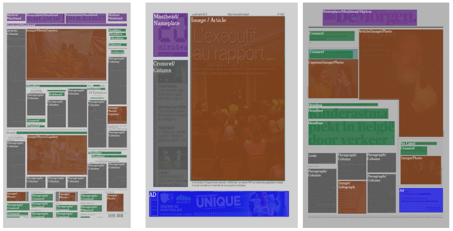
The understanding of newspaper document structure can help in the adaptation of text and visual content for different devices and media [53], as well as, in the context of low vision, to enhance accessibility by combining magnification and text-to-speech aids. However, automated segmentation of complex document structures like newspapers remains an ongoing challenge due its dense layout with numerous visual and textual design elements [38], [44].
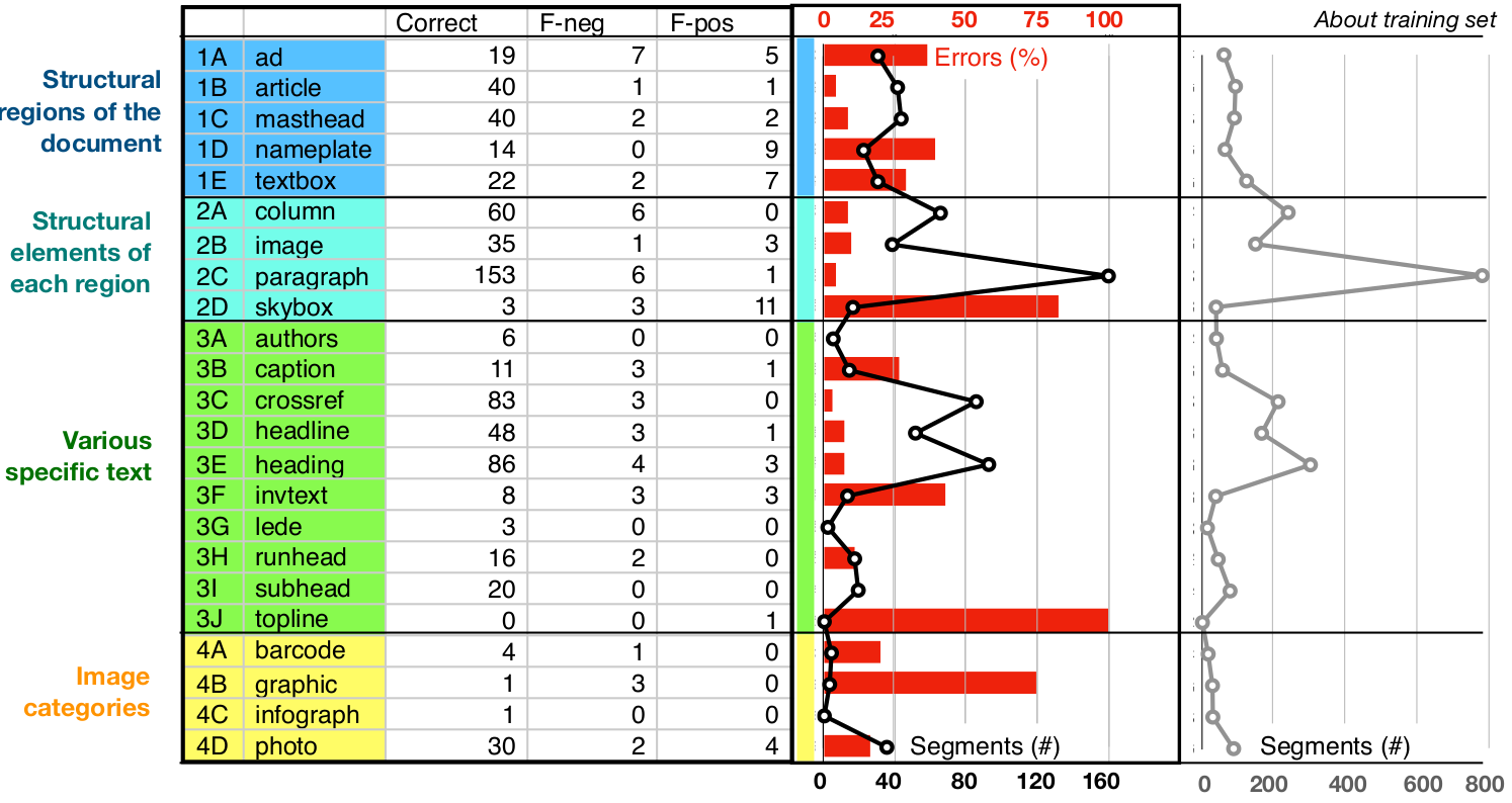
To address this challenge, we propose a multi-layered analysis of structure and design, presented in [27]. Taking images of newspaper front pages as input, our approach uses a combination of computer vision techniques to segment newspapers with complex layouts into meaningful blocks of varying degrees of granularity, and convolutional neural network (CNN) to classify each block. The final output presents a visualization of the various design elements present in the newspaper such as in Figure 2. Compared to previous approaches, our method introduces a much larger set of design-related labels (23 labels against less than 10 before) resulting in a very fine description of the pages, with high accuracy (83%), as shown in Figure 3.
|
|
This work is presented in [27].
Towards accessible news reading design in virtual reality for low vision
Participants : Hui-Yin Wu, Aurélie Calabrèse, Pierre Kornprobst.
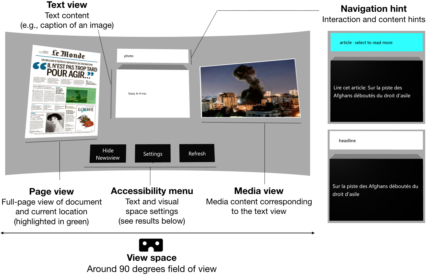
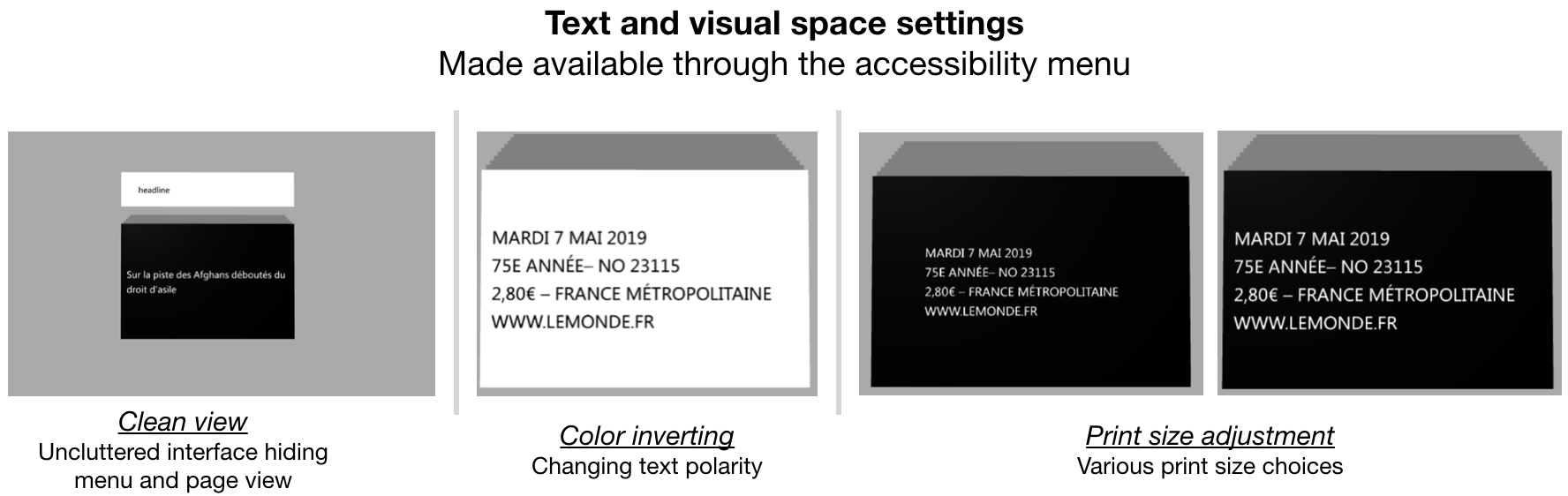
Low-vision conditions resulting in partial loss of the visual field strongly affect patients’ daily tasks and routines, and none more prominently than the ability to access text. Though vision aids such as magnifiers, digital screens, and text-to-speech devices can improve overall accessibility to text, news media, which is non-linear and has complex and volatile formatting, bars low-vision patients from easy access to essential news content [54].
Our aim is to position virtual reality as the next step towards accessible and enjoyable news reading for the low vision. Our ongoing work, which we present in [26], consists of an extensive review into existing research on low-vision reading technologies and accessibility for modern news media. From previous research and studies, we then conduct an analysis into the advantages of virtual reality for low-vision reading and propose comprehensive guidelines for visual accessibility design in virtual reality, with a focus on reading. This is coupled with a hands-on study of eight reading applications in virtual reality to evaluate how accessibility design is currently implemented in existing products. Finally, we present a framework that integrates the design principles resulting from our analysis and study, and implement a proof-of-concept for this framework using browser-based graphics (Figure 4 and 5) to demonstrate the feasibility of our proposal with modern virtual reality technology.
|
|
This work is presented in [26].