Section:
New Results
A Study on Dual-Scale Data Charts
We presented the results of a user study that compares different ways of representing dual-scale data charts (see Fig. 7 ). Dual-scale charts incorporate two different
data resolutions into one chart in order to emphasize data in regions of interest or to enable the comparison of data from distant regions. While some design guidelines exist for these types of charts, there is currently little empirical evidence on which to base their design. We filled this gap by discussing the design space of dual-scale cartesian-coordinate charts and by experimentally comparing the performance of different chart types with respect to elementary graphical perception tasks such as comparing lengths and distances. Our study suggests that cut-out charts which include collocated full context and focus are the best alternative, and that superimposed charts in which focus and context overlap on top of each other should be avoided.
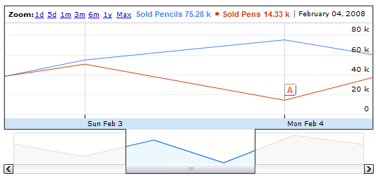
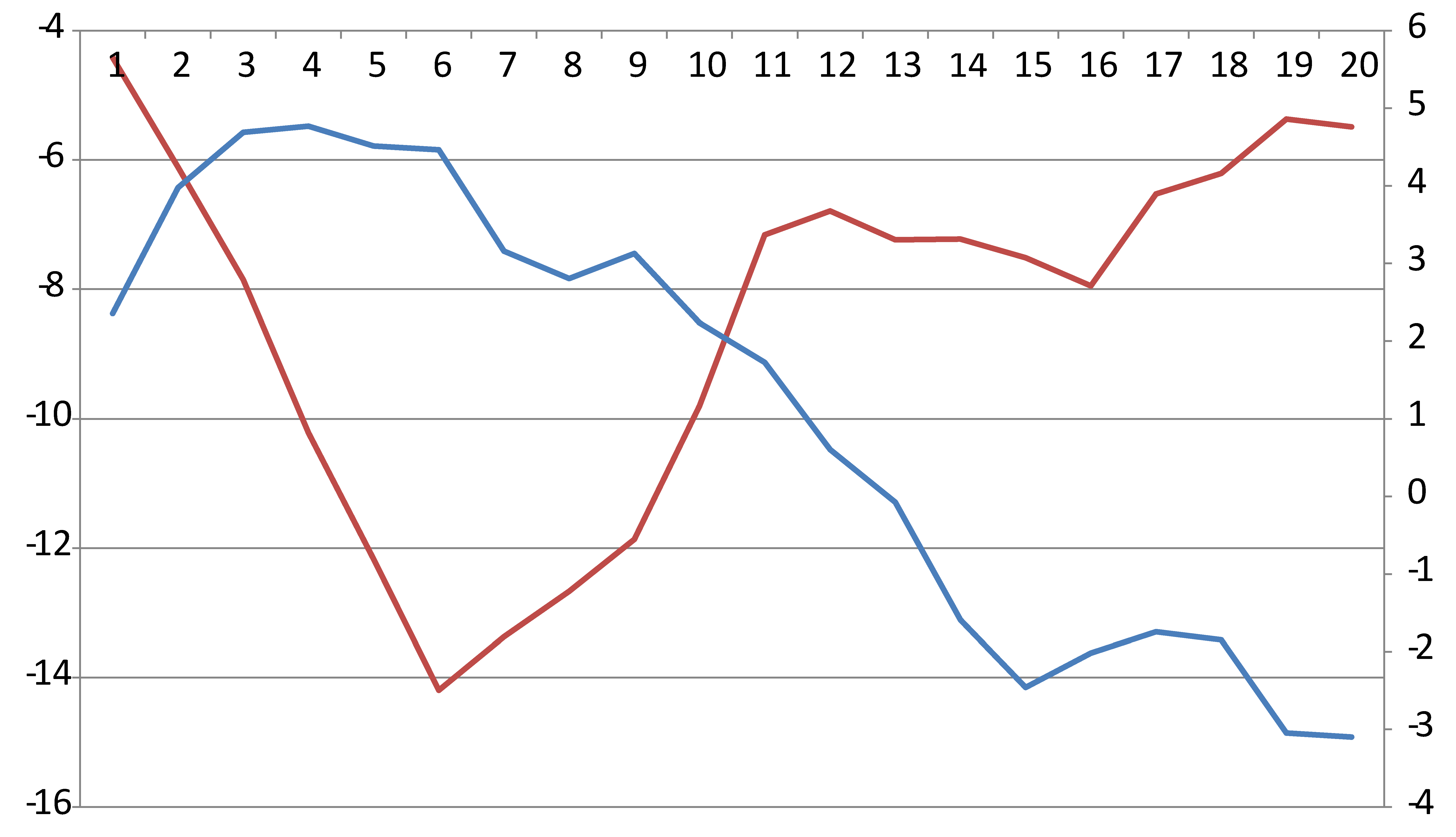
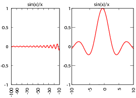
Figure
7. Three different dual-chart techniques made with different publicly available charting tools. The left image shows a cut-out chart made with the Google Charts API in which the top part depicts parts of the data at larger scale. The middle image shows a superimposed chart made by Microsoft Excel where the red line is plotted according to the left and the blue according to the right -axis. The right chart is a Broken Chart made with Gnuplot in which the left and right panel show parts of the data at different scale. |