

Section: New Results
Visualizing Ranges over Time on Mobile Phones: A Task-Based Crowdsourced Evaluation
Participants : Matthew Brehmer [Microsoft Research, USA] , Bongshin Lee [Microsoft Research, USA] , Petra Isenberg [correspondant] , Eun Kyoung Choe [University of Maryland, USA] .
|
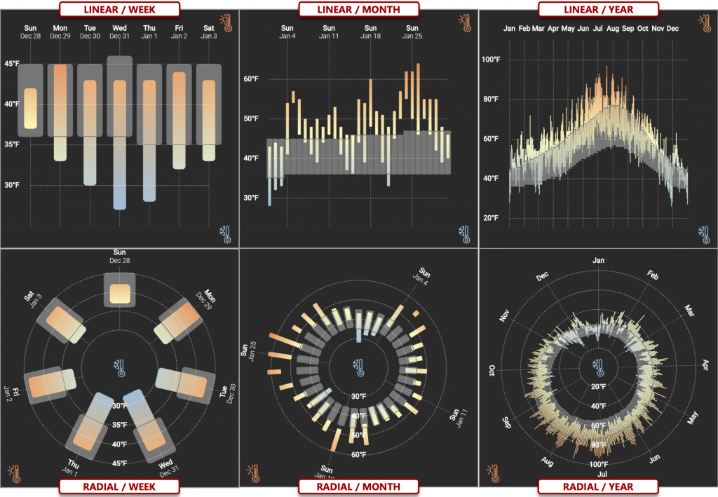
In the first crowdsourced visualization experiment conducted exclusively on mobile phones, we experimentally compare approaches to visualizing ranges over time on small displays. People routinely consume such data via a mobile phone, from temperatures in weather forecasting apps to sleep and blood pressure readings in personal health apps. However, we lack guidance on how to effectively visualize ranges on small displays in the context of different value retrieval and comparison tasks, or with respect to different data characteristics such as periodicity, seasonality, or the cardinality of ranges. Central to our experiment is a comparison between two ways to lay out ranges: a more conventional linear layout strikes a balance between quantitative and chronological scale resolution, while a less conventional radial layout emphasizes the cyclicality of time and may prioritize discrimination between values at its periphery. With results from 87 crowd workers, we found that while participants completed tasks more quickly with linear layouts than with radial ones, there were few differences in terms of error rate between layout conditions. We also found that participants performed similarly with both layouts in tasks that involved comparing superimposed observed and average ranges.
More on the project Web page.