

Section: New Results
Visualization
|
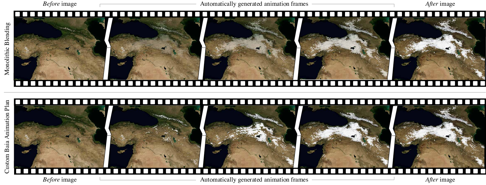
A significant part of our activity in this axis has been dedicated to geovisualization for various surfaces, including desktop workstations, tabletops and wall displays, in the context of ANR project MapMuxing. We investigated the representation of time in geovisualizations, more particularly how to convey changes in satellite images. Before-and-after images show how entities in a given region have evolved over a specific period of time. These images are used both for data analysis and to illustrate the resulting findings to diverse audiences. We introduced Baia [4], a framework to create advanced animated transitions, called animation plans, between before-and-after images. Baia relies on a pixel-based transition model that gives authors much expressive power, while keeping animations for common types of changes easy to create thanks to predefined animation primitives (Figures 7 and 2).
Still in the area of geovisualization, in the context of ADT project Seawall, conducted in collaboration with project-team Lemon at Inria SAM / Montpellier and with Inria Chile, we have participated to the 2018 SciVis contest, which this year was about the visualization of data related to tsunamis generated by the impact of asteroids in deep water [31]. We used the WILDER ultra-high-resolution wall display to make it easier for analysts to visually compare and contrast different simulations from a deep water asteroid impact ensemble dataset. See Section 5.7.1 and Figure 3.
In the area of scientific data analysis, we have been collaborating with neuroscientists that explore large quantities of EEG data at different temporal scales. As a first step, we explored if automated algorithmic processes, that aid in the search for similar patterns in large datasets, actually match human intuition. We studied if we perceive as similar the results of these automatic measures, using three time-series visualizations: line charts, horizon graphs and colorfields. Our findings [15], [30] indicate that the notion of similarity is visualization-dependent, and that the best visual encoding varies depending on the automatic similarity measure considered.
Anstasia Bezerianos co-advised the PhD work of Evanthia Dimara in project-team Aviz together with P. Dragicevic. Last year, they had already confirmed that the cognitive bias known as the attraction effect does exist in visualizations [49]. This was followed-up this year by an exploration of different ways to mitigate this bias [12] (in collaboration with Northwestern University and Sorbonne Université). It was observed that the approach that consists of deleting all unwanted alternatives interactively removed the bias, a result that previous research has shown to be extremely hard to achieve. They also explored how different interactive visualizations of multidimensional datasets can affect decision making [13], and created a task-based taxonomy of cognitive biases for information visualization [14].
Our collaboration with INRA researchers has focused on mixed-initiative systems that combine human learning, machine learning and evolution. Results in this area for this year include an interactive evolutionary algorithm to learn from user interactions and steer the exploration of multidimensional datasets towards two-dimensional projections that are interesting to the analyst, and guidelines on how to evaluate such mixed initiative systems [29].